

Client
Wayble
Year
2024 - 2025
Read time
10 min
What does buying suit for a wedding, getting a funny quote mug or receiving a birthday party invitation have in common? We like it to be customized for us. And similar to previous examples, this case study shows the process of designing a copilot that creates tailored experiences for international students on Wayble platform.
Keep reading to learn how the idea was born, what steps I took to go from ideation to finished designs and challenges throughout the process.
Wayble is a comprehensive digital platform for international students used by dozens institutions across Canada. Colleges and universities use Wayble's extensive range of tools to help guide their students on their academic and personal journeys.
Students' success is ensured by providing them with valuable features:
.png)
.png)
.png)
.png)
.png)
I have started working with Wayble in 2024 helping improve platform's UX and modernize UI. With Wayble being a small tech start-up (~12 people) I am often involved in product planning conversations with engineers and CEO. After conducting a number of pitches and going through demos with institutions Wayble's CEO realized the potential for a new flagship feature — an automated assistant.
Clients expressed high level of interest towards a more automated solution that would consolidate existing features. So we started planning for a co-pilot that would be capable of providing custom experience based on the individual student's information.
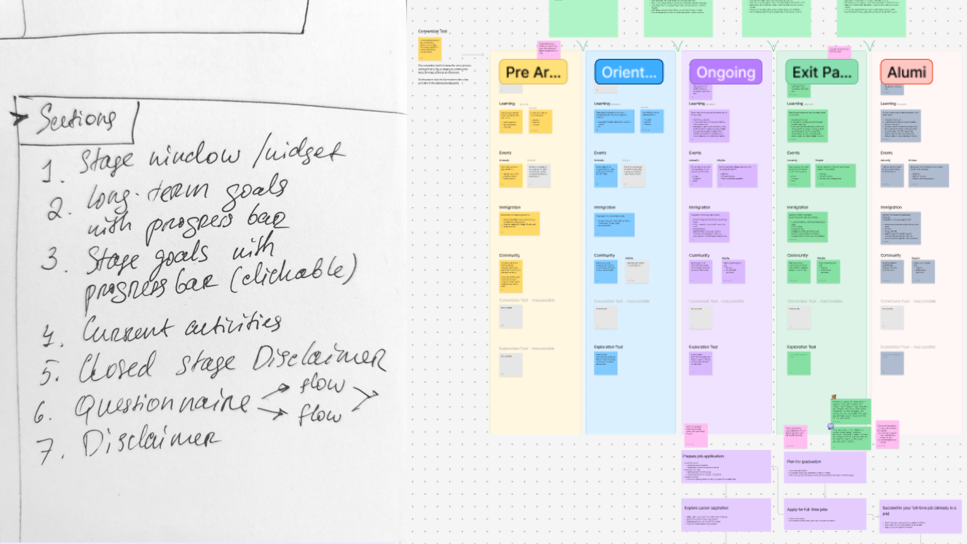
After validating demand for this feature with institutions we started fleshing-out the functionality logic. This stage involved lots of sticky notes and conversations around the data collection, onboarding, user flows and actions that should be available to the students. This helped me gain an understanding of desired end-to-end experience within this feature. After a few ideation sessions we came up with core building blocks:
At this point the biggest question for me was: how do we present this complexity to the users without overwhelming them?
For students to be able to perform all actions quickly I chose to consolidate everything on one modular page. Onboarding, questionnaires, surveys and other flows that are required to receive data for customized recommendations would be either connected to the main Wayble Co-pilot screen or displayed on it. I also identified that, depending on the completion of different stages and other criteria, student should see different states of Wayble Co-pilot screen:
I started putting together first drafts while we were wrapping up with planning and ideation. Even though I didn't have final information architecture It was useful to have something visual to continue conversation and pivot from there.
First low-fidelity version was as simple as it gets and looked more like a to-do list.
Second iteration introduced more features that would make it into the final version. Now the users would be able to switch between long-term goals and current activities, change their goals and navigate easier between stages. I started thinking about different types of activities and how interactivity can help users navigate through the UI. Incorporating navigation elements into activity containers when users hover-over them was where I started to experiment with it (it was abandoned later to accommodate for responsiveness).
I also started incorporating some basic visual elements like path background behind the stage selector and stage indicator illustrations to bring in Wayble's personality.
After reviewing previous wireframes we realized that we can eliminate constant switching between tabs by bringing all widgets on the same page. I relocated long-term goals to the main page, next to stage selector.
I also split activities into two subsections to focus more on to-do activities rather than displaying completed ones at the top. After all, we wanted users to keep progressing through stages and the best way to do it is to put incomplete tasks in front of them.
Once we were happy with the overall page structure I fleshed-out the first high-fidelity version. Apart from applying Wayble branding and working on visual presentation, I added stage goals section and made long-term goals less prominent since they won't change from stage to stage.
Each activity received its own icon and color treatment so that it is easier to tell different tasks apart (watch a video, read a blog post, attend an event, etc.).
Even though this high-fidelity wireframe looked good for everyone on the team, Wayble's lead engineer proposed we do a few more iteration. The reason for it was to make the connection and the flow (stage -> stage goals -> my activities) even more clear for students who would see Wayble Way for the first time.
This is where I experimented more with overall layout, sections visual presentation and hierarchy.
At some point I was presented with a new requirement which made its way into the design process far too late — theming. Originally, this automated assistant was planned to be Wayble branded feature. This would help it become more recognizable and marketable. However, due to the gaps in the discovery process the need for the institution custom theming was not uncovered until later.
And even though this new requirement set us back, it was an opportunity to improve UI even further and ensure client satisfaction.
So I had to take a step back from what we thought was a solid option and go back to low-fidelity screens to rework how styling is applied to all components based on the new approach that involves theming changes to color and type.
This iteration also helped us uncover an insight about long-term goals section — It was too prominent taking focus away from stage goals and activities, even though this section wouldn't be interacted with often.
I reworked its look, made the section sticky and moved it to the bottom of the screen. This way it will always be in the view with the option to hover over and reveal more information about a particular long-term goal.
Now, having all requirements and a complete information architecture plan I was able to create wireframes for each of the Wayble Co-pilot dashboard variants with consistent navigation and interactive elements.
After redesigning Wayble Co-pilot dashboard, questionnaire and survey flows and other elements a number of times we finally arrived at v1.0 which made its way into production!
We will continue improving it based on institutions and students' feedback as we get more insights on how it is being used.
Wayble Co-pilot - Interactive prototype.
Wayble Co-pilot also accommodates theming for a number of interactive and decorative elements based on the institution style guide helping make experience consistent.
As for the hand-off to the development team, I created an implementation guide that explains how to apply styles to certain visual elements to allow support of theming feature. Here are a few screens from implementation guide:
During this project I contributed to the product feature planning and ideation, created low-fidelity and final designs, provided implementation style guide and multiple QA documents. This resulted in a collection of development blueprints ready for implementation into a flagship feature - Wayble Co-pilot.
Carbon Graph
Improving information organization and UI of a life-cycle assessment product.
|
Web-app / Motion graphics


Evoke Health
Modernizing senior care EHR app while ensuring compliance with accessibility standards.
|
Web-app


