

Role
UX/UI Designer
Company
Carbon Graph
Timeframe
2 months
A tool for sustainability analysts to compare emissions across industries and products. I designed new features, improved navigation and data visualization to reduce cognitive load and help users extract actionable insights from complex data.
New organizational dashboard feature for high-level insights
Carbon Graph is a supply chain sustainability platform designed for manufacturing companies seeking to reduce carbon emissions. Through dynamic lifecycle carbon footprinting, Carbon Graph helps users identify the greatest sources of carbon intensity and risk (hotspots) and develop targeted, cost-effective reduction strategies.
Carbon Graph’s team was looking to drive sales interest and expand functionality for existing clients. They had a feature roadmap, multiple developers, and sustainability consultants, but lacked product design expertise to further evolve the platform and address usability issues.


Carbon Graph's platform features
At its current stage, the platform limited sustainability analysts and organizational decision-makers in their ability to extract actionable insights and make informed decisions.
Users struggled to quickly access required information and explore detailed product journeys. Additionally, data was presented in ways that were difficult to interpret, especially for less technically inclined stakeholders responsible for making strategic decisions.
After identifying the key areas of improvement, Carbon Graph’s team and I aligned on several goals:

To better understand the current state of the platform, I began with a product audit and competitor research. The audit revealed several structural issues: navigation between pages was unclear, information lacked hierarchy, and key insights were difficult to interpret.
Competitor research showed that most existing tools were highly specialized and often focused on narrower datasets. Many lacked the comprehensive scope-3 emissions capabilities that Carbon Graph was developing.
Before the redesign, Carbon Graph’s platform pages behaved more like static website pages, offering limited functionality for extracting detailed insights.
I also explored visual inspiration from other data-heavy platforms to better understand how complex information could be structured and visualized effectively. This research helped inform the direction for the interface and dashboard design.
Finally, I sketched low-fidelity wireframes starting on paper and later moving them into Figma. This allowed me to explore different ways of organizing information and presenting insights more clearly while also having some visuals we could use to further internal discussion with Carbon Graph’s team.
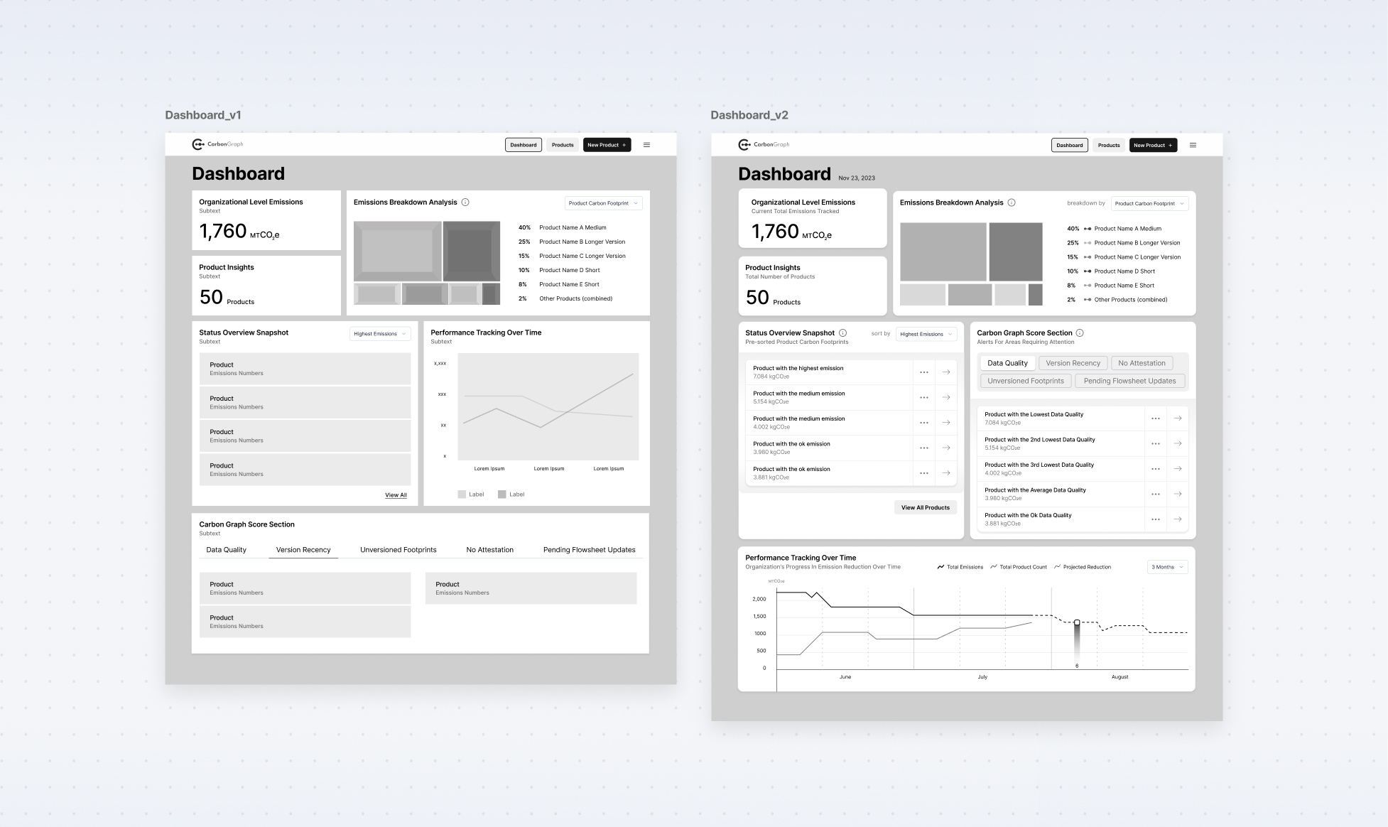
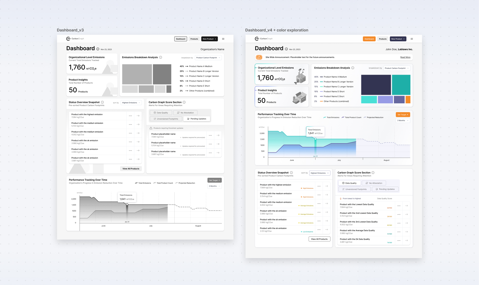
Exploring layout varitions for the organizational dashboard
One of the main challenges was developing a strong understanding of the platform’s technical complexity and how sustainability analysts typically used the system.
The design needed to balance two competing factors: providing deep analytical capabilities while keeping the interface clear and accessible for decision-makers who were less technically focused. Because of this I prioritized clear viusual hierarchy, unambiguous labelling of action elements and familiar navigation patterns.
Navigation was the first area I addressed. The primary navigation bar provides three main actions: viewing the organizational dashboard, accessing the product list, or creating a new product. These options allow users to quickly access high-level insights.
A secondary sidebar navigation appears once a user selects an individual product. Because product-level analysis includes multiple specialized tools, the sidebar provides a structured way to move between pages without losing context.
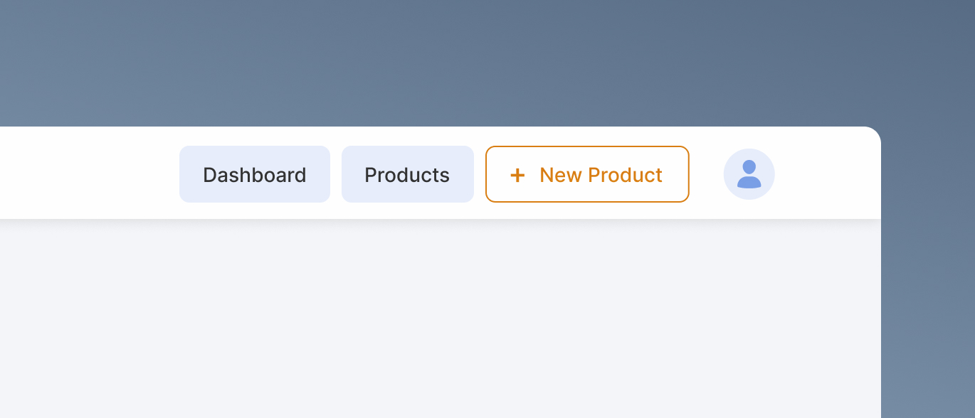
Main navigation bar has only three items. It focuses on getting users to high-level overview pages.
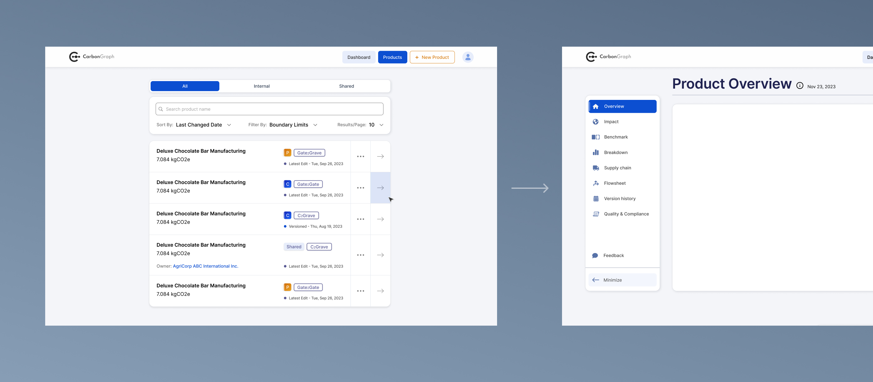
Secondary side navigation bar appears when user goes to inspect an individual product.
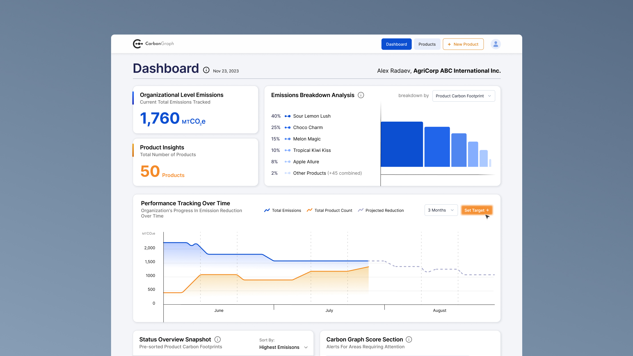
The organizational dashboard was introduced as a new feature designed to provide a high-level overview of emissions across all products. The interface prioritizes simple, easily understandable metrics paired with data visualization tools. This allows decision-makers to quickly assess overall performance and identify potential areas of concern.
Users can explore deeper insights through additional widgets positioned further down the page, which provide more granular comparisons between products.
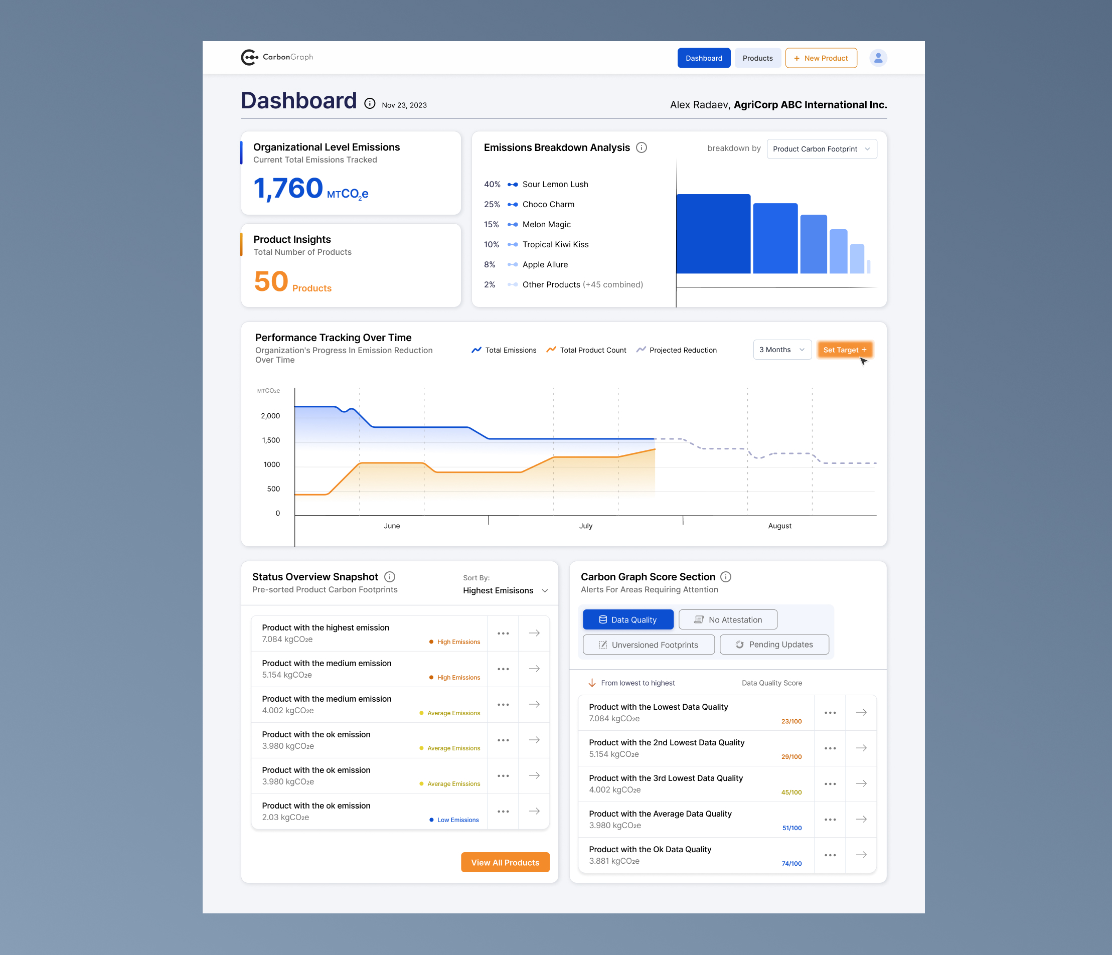
Organizational dashboard aims to provide high-level insights of emissions across all products for less technical decision makers.
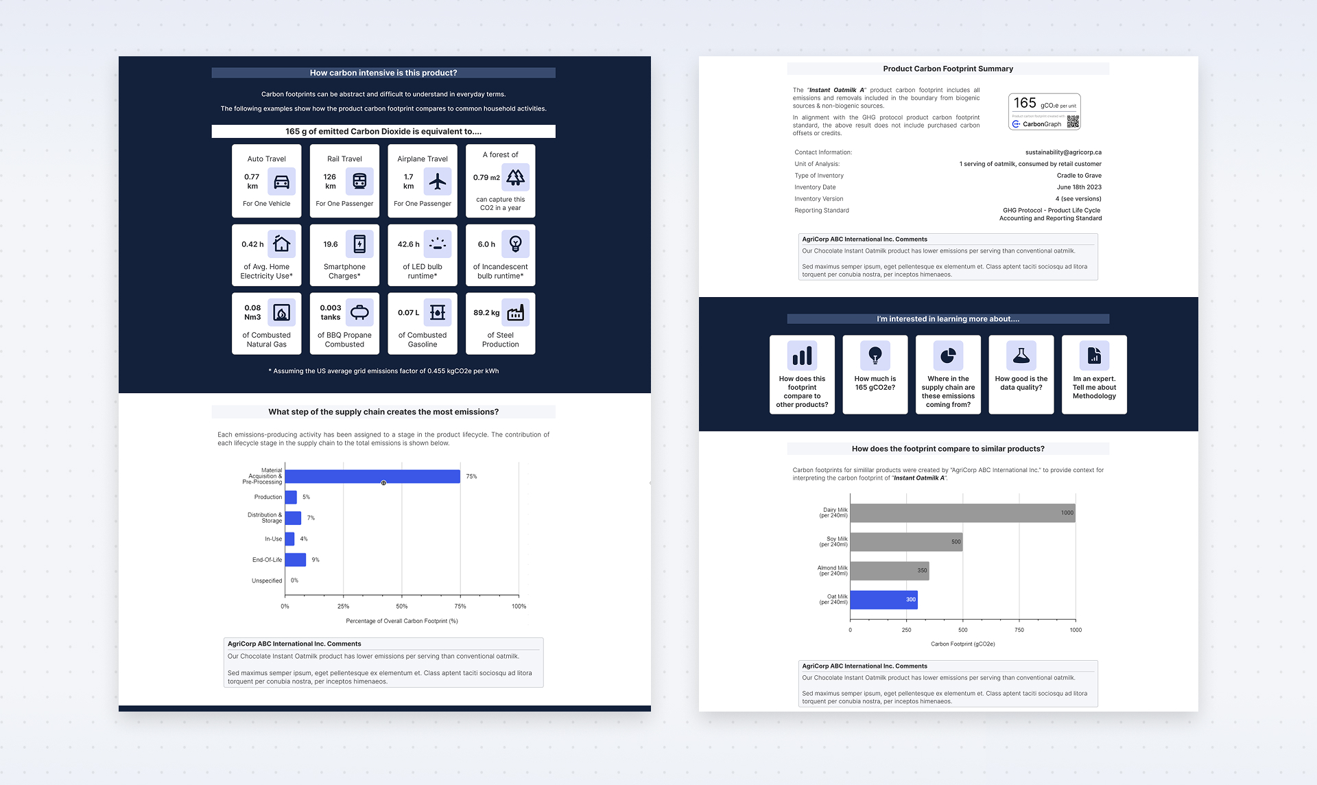
The individual product overview page was a redesign of an existing feature. The focus here was improving information organization and visual hierarchy so users could quickly analyze a product’s lifecycle data and identify areas requiring attention.
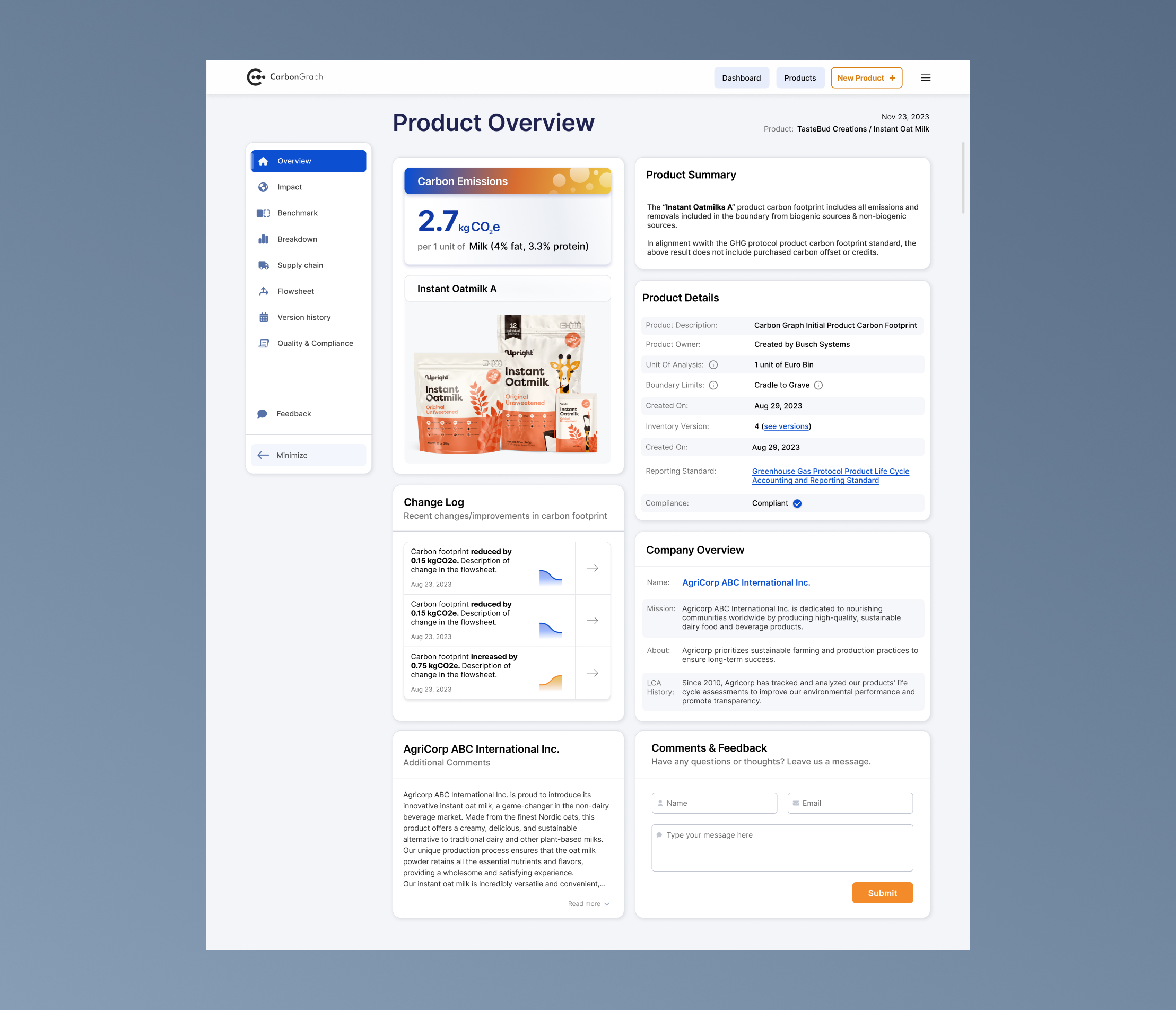
Individual product dashboard redesign aims to provide a comprehensive overview for most impactful product areas.
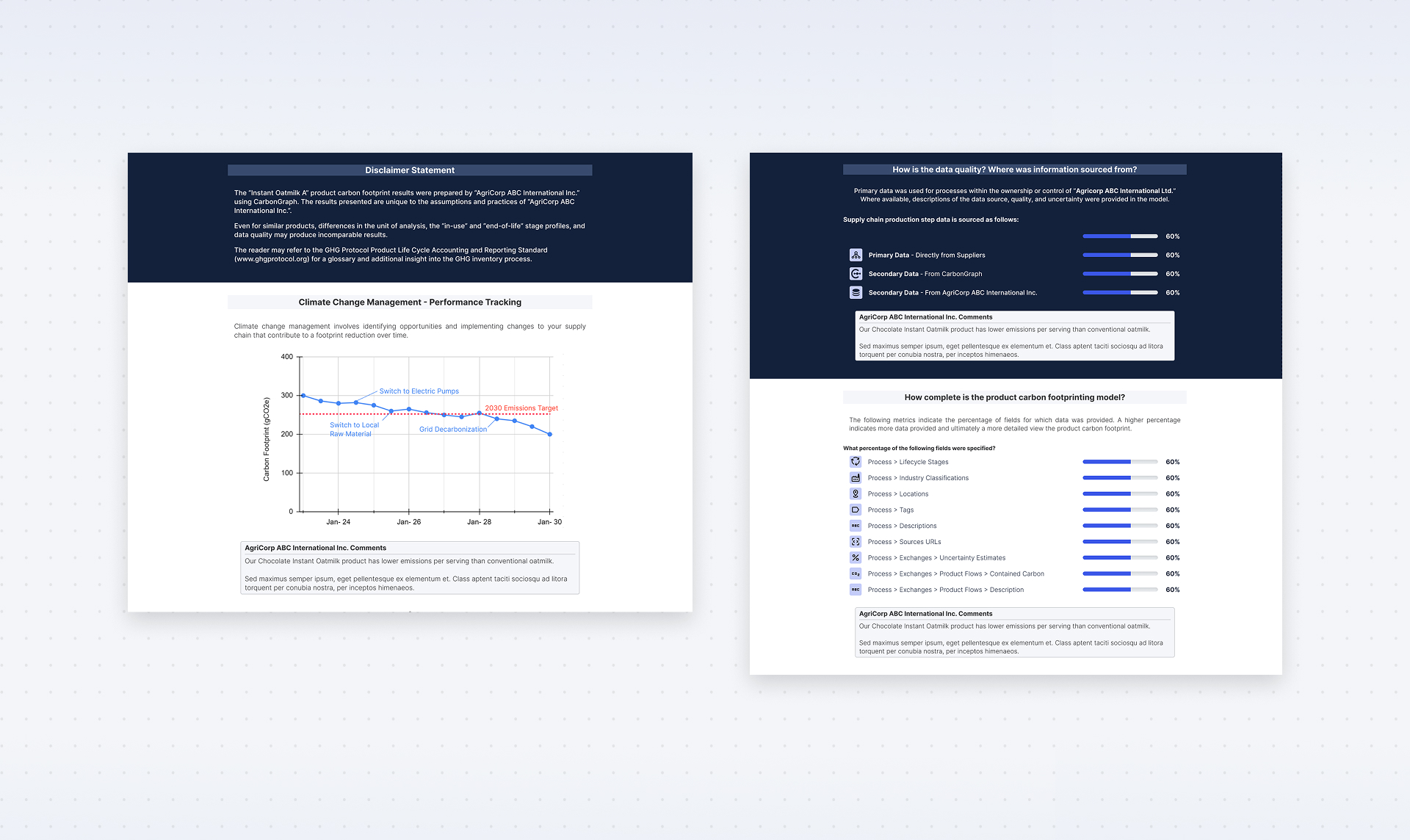
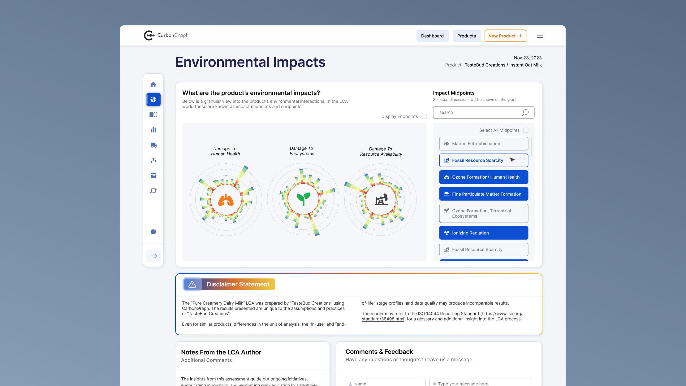
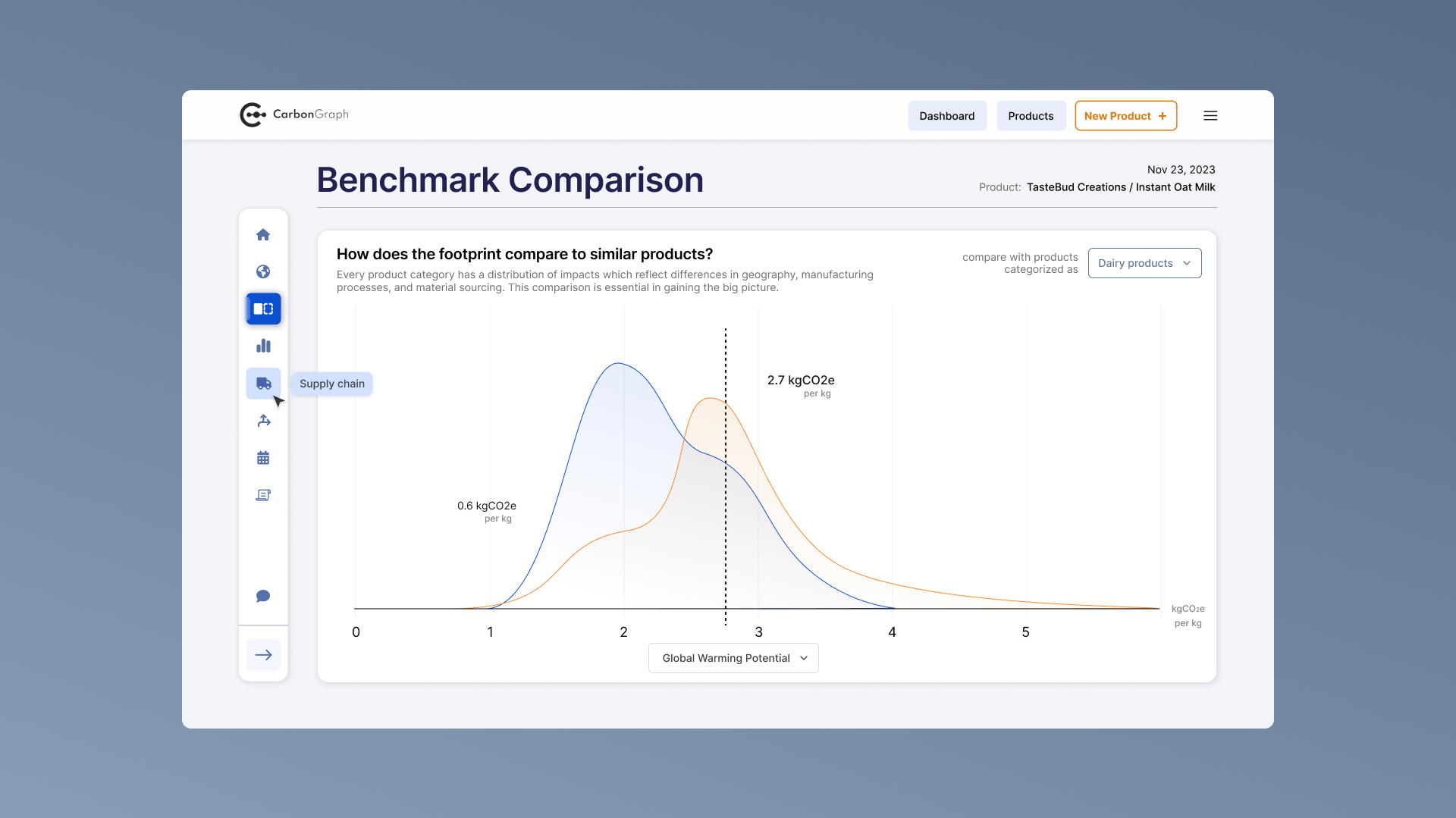
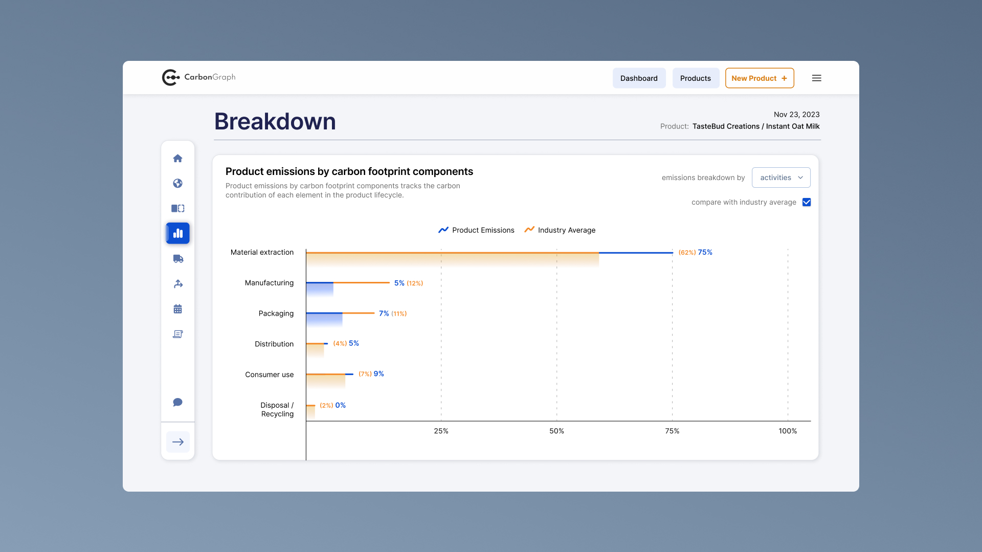
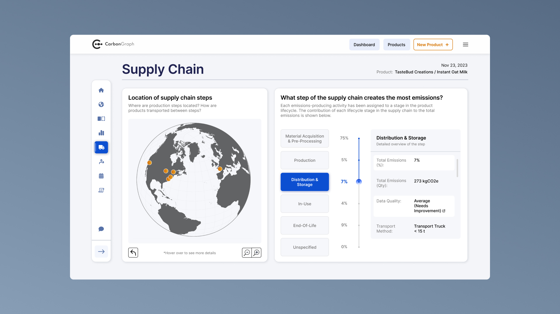
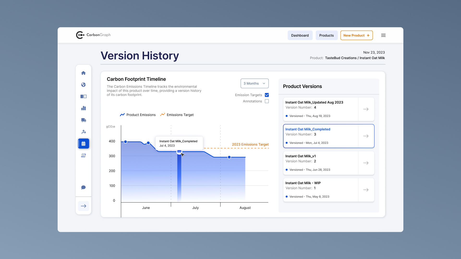
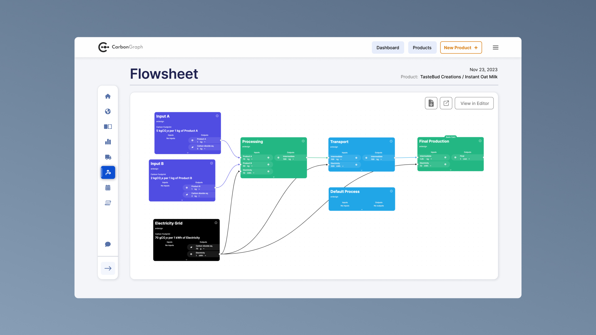
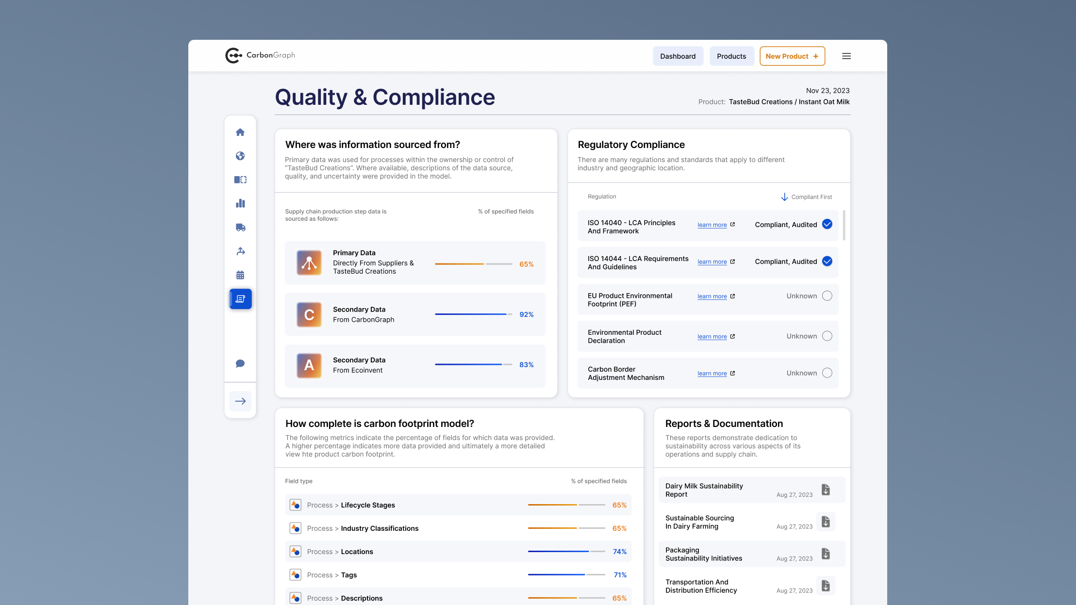
Additional product pages provide more granular insights into specific aspects of a product’s lifecycle. For these views, I focused on tailoring each visualization to the type of data being presented. This helped reduce friction, improve readability, and make analytical tools more intuitive to use.
By the end of the project, Carbon Graph had a fully redesigned lifecycle assessment platform that included:

These improvements equipped decision-makers with the ability to quickly scan high-level metrics, interpret complex data, and use findings to strategically reduce emissions.

Finished product dashboard mockup

Evoke Health
Improved staff user management and operational visibility for a senior care EHR platform
|
Web-app
Wayble
Guiding higher-education students with personalized resources
|
Web-app